

Erin Hiemstra, cofounder of design firm Studio Trovato and the creative who started Apartment 34, has always gravitated toward shades of brown. “I’m a child of the ‘70s, so I grew up around a lot of brown interiors,” she says. So you could say Hiemstra has been pretty happy to see the hue popping up beyond leather sofas and wood dining tables recently. “I think the big resurgence I started seeing first was darker kitchens,” she shares. She clocked hits of brown in Sandra Bullock’s Brooklyn townhome, designed by Ashe Leandro, in Lauren Santo Domingo’s Jackson Hole ski retreat, and in a number of projects by Jake Arnold. When Pantone dubbed Mocha Mousse as its 2025 color of the year, brown’s comeback seemed more official than ever.
This trend hits differently from when Millennial Pink came on the scene or cherry red got its 15 minutes of fame. For Hiemstra, everyone else’s embrace of brown confirmed what she already knew to be true: decorating with neutrals can be fun. “The world of brown is so vast that it lets you layer and create texture, even if you’re working with a limited color palette,” she says. Read on for the pro’s advice on how to decorate with brown, plus all the spaces inspiring us to lean into umber and get creative with chestnut.
Hiemstra is already thinking of ways to weave brown into her next projects. “I’d love to convince a client to let me paint with some dark browns,” she shares, adding that she secretly wants a big cozy sofa in a chocolate mohair for herself. “But I have a white French bulldog, so I know better,” she laughs. In all seriousness, here are four products she’d buy ASAP.

“A camel brown sofa is just as luxe as your camel brown coat.”
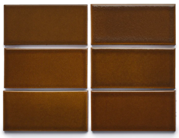
“San Francisco-based tile maker Heath Ceramics does beautiful hand-applied glazes. I’d love to do this in a double-stacked checkerboard pattern on a kids’ bathroom floor.”

“The Pipistrello is a timeless design icon and I love its mix of brown, steel, and white.”
“I’d actually love to use a rich brown limewash in a powder bath. U.K.-based company Bauwerk Colour has the perfect saturated hues I’m craving.”

What to Pair with Brown, According to a Designer

While blacks, creams, and whites would work well with any tone of brown, Hiemstra says, if you want to hone in on darker, chocolate-y tones, try pairing it with baby blue for an unexpected twist. “Colin King’s apartment (when he put those Tiffany blue chairs in his living room) is a great example of that,” says Hiemstra.
Super light tones look especially nice alongside deep reds, ochres, and forest green. Really, in the end, it all comes down to context, says the designer. “You could go cabin-y or you could go crisp and urban with by using brighter blues or brighter reds—that’ll make it feel much more contemporary,” says the designer.
Brown Interiors to Get Inspired By

Can’t quite picture what Hiemstra means by teaming brown up with powder blue? Peep this loungey corner designed by CLO Studios where founder Chloe Tozer sat two of her Gigi Slipper Chairs on top of a solid-colored rug.

Benjamin Moore’s Hasbrouck Brown sets the stage for a traditional vestibule in this Blank Marine Interieurs project. When in doubt, fill a brown room with antique furniture and brass lighting.

The rich brown Mario Bellini sofa in this Ome Dezin-designed living room harkens back to the Brentwood home’s 1970s beginnings.

When Hiemstra said brown lends itself to layering, she wasn’t exaggerating. In this Prospect Refuge Studio project, paint, wood, and plush linens result in the hot chocolate version of a bedroom.

Kirsten Blazek felt like oak wood cabinets in mid-century homes had overstayed their welcome, so instead she leaned into a retro vibe with walnut doors and a brown tile backsplash that has a slight orange undertone to it for a hint of color.

Who said your interior doors have to stay the same color that they came in? Designer Danica Gadeken topped off her rustic laundry room with paneled doors painted in Muted Mahogany from HGTV Home by Sherwin-Williams.

DIYer and design blogger Valeria Jacobs also thought her laundry room would be the perfect spot to play with brown, except she covered her plywood built-ins in Little Greene’s Ganache.

Meg Kelly, the founder of Nashville-based design firm Clella Design, skewed toward a warmer tone in this attic office by swathing the space in Reddish Brown by Farrow & Ball.

Rocco cofounder Alyse Borkan’s bathrooms used to be unfortunate shades of purple and pink, but she loved how the walls were clad in 4×4 tiles. So, she took cues from the past and used smaller-scale squares in earthy tones—including a soaking tub swathed in brown.

“Every space needs a bit of brown,” says Melissa Colgan, whose Washington D.C. apartment is filled with sepia-toned furnishings and coffee-tinged fabrics. Colgan was methodical about her approach, juxtaposing dark chocolates with ochre, raspberry, and periwinkle—softer pastels that pick up on the patina of antique textiles.

To cool off the copper-bronze undertones in this dining room’s tiled walls, Australian firm Kennedy Nolan incorporated ultramarine shapes in the buffet cabinet.

White paint serves two purposes in designer and blogger Liz Kamarul’s entryway: It creates the illusion of real archways above the door frames and visually lightens the walls, which are swathed in Behr’s Toasted Bagel.

In this Brussels house, Paris-based designer Pierre Yovanovitch left the paint brush at home. The wall and mantel in the dining room look like they’re covered in Venetian plaster, but what you’re actually seeing is patinated steel. A far cry from a rusty bike left out in the rain, the burnished cocoa tones exude the same warmth as a beloved leather sofa.


